Branding
Branding

DefiningColors & Fonts
#0B9444
#002A38
#E7E8E9
Due to the nature of her practice, Jean was originally looking for two separate logos: one that was more traditional and one more centered on the cannabis aspect. After sending a few ideas her way, she realized she didn't have to compromise with two separate styles. We created a traditional pillar design out of her practice's initials, while still representing her focus on cannabis through the leaves on top. We paired this with more classic fonts and a mix of traditional colors with the pop of green. The effect was a perfect blend of two contrasting styles.
Web Design
Web Design
TailoredWebsite
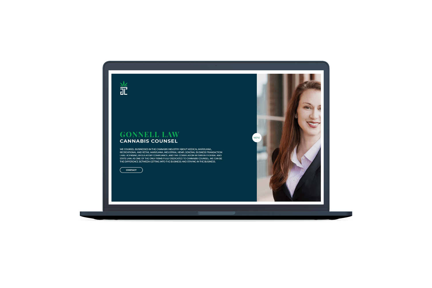
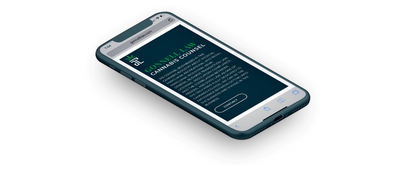
As Jean was still developing this cross-country firm, she needed a website up right away; only some basic information was necessary, the rest could come later. So we designed a landing page to meet those basics: who she is, what her firm is about, and how to get in touch. We produced a simple and sophisticated design to represent her to those she hopes to one day represent.


Testimonial
Testimonial
“Dru Golden and Chrissy VanScoten with VanGo Creative designed and implemented the new logo, branding, and webpage for our cannabis law firm, Gonnell Law. With minimal input, and at an affordable cost, they created a high-quality and professional product that is utilized in nearly every aspect of our practice. If their Charlotte-based creative firm can benefit a Denver-based cannabis law firm such as ours, just imagine what they can do for your local business.“
Back to Portfolio


